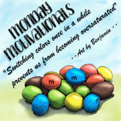
Last Motivation I talked about which color is my favorite M&M’s color. Yes, it is green. I also have a least favorite, that is brown. That’s my least favorite M&M’s color, I don’t like that dark brown compared to all the other happy, cheerful colors. Actually, I’m not a fan of brown at all, at least not those deep dark brown colors. Unless they’re on trees, for some reason I don’t mind brown trees, but anything else, not really. Wood brown, okay, other brown, not okay. Oh wait, there is another exception…. a couch or dining chairs. To me dark brown just looks good on them.
Now that I’ve got you thinking about colors, let’s talk colors. Do your artworks favor certain colors? Mine do. The more green, the better. Use lots of purple, nice and deep tones and all kinds of green values alongside greenish tones and your artwork is sure to catch my attention. If an artist uses lots of browns, I might not even look at the artwork. I know I’m biased; do you recognize that in yourself? When surfing on the web, visiting artist’s websites, looking at Facebook pages or browsing images on Instagram I see artists favoring certain colors. I’m not the only one that’s slightly or completely biased towards certain colors.
I’m not saying there’s anything wrong with that, but it can create a tunnel vision we get stuck in, using the same colors again and again can be become stale, perhaps boring and even demotivating eventually. Let’s also take a look at our audience’s perspective for a moment. If we continually use the same color range, our audience will recognize our work, that’s for sure. That’s on one hand a good thing. On the other hand, it creates the danger of being too familiar, as if they’ve seen it all before. Our work becomes less interesting, less appealing. Once in a while it is great to throw your audience off with a little experiment, with something they don’t expect. It is also good for our creative juices, so to speak. It opens new possibilities of creativity for us as artists. Switching colors once in a while prevents us from becoming oversaturated. By using unlikeable colors, we come to appreciate them more. I’m not saying we’ll fall in love with them, but we sure start to appreciate the unlikeable once we start using them. They might even surprise us, add a new dimension to our art.
Here’s the challenge I want to challenge you and me with….. use that color you don’t like. For your next (experimental) artwork, pick colors you normally don’t use at all. Go a step further, take these colors in mind and think of an artwork that would totally suit them. Surprise yourself and the world around you. Give these, in your eyes, unlikeable colors a little bit of love and be surprised how motivating a simple switch of colors can be.
Well, for me it’s time to go now, since I’ve got a date….. a date with Miss Brown, I do hope she can forgive me for neglecting and even avoiding her for all too long.

